Week 3 – Still Life Painting
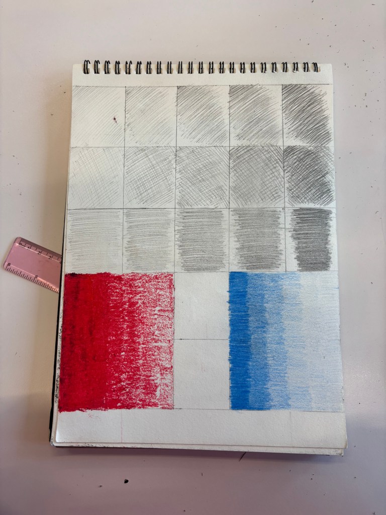
This activity is about shading and tone, I have demonstrated using different pencils to create different shades from dark to light. In addition, using oil pastels and colored pencils to create different shades from dark to light.
This exercise helped me understand the different shades when using pencils and colors, which helps to create more realistic still lifes.
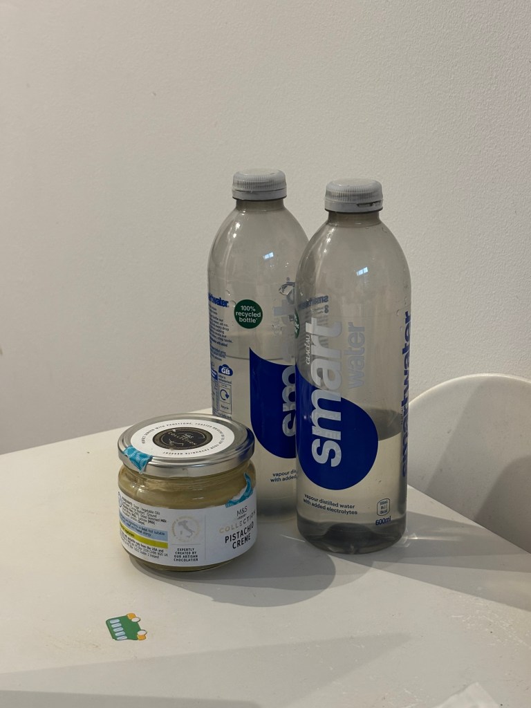
I undertook a still life drawing exercise using graphite pencil on my sketchbook . The setup consisted of three everyday objects placed on a white surface: a small glass jar of pistachio creme and two plastic water bottles. I chose this arrangement for the contrasting forms and surfaces: the short, cylindrical, opaque glass jar versus the taller, slightly narrower, translucent plastic bottles. The primary goal was a technical study of form, proportion, and value (shading).
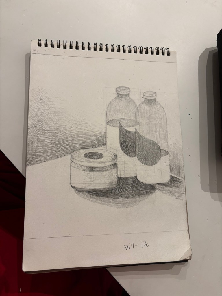
I first established proportion and placement using light construction lines, ensuring accurate alignment. A major focus was drawing precise ellipses for the cylindrical forms, which is key to showing them resting correctly in space. I conveyed volume by using hatching and cross-hatching to model the objects, applying the darkest tones in the core and casting shadows based on the dominant light source.Especially, I use various pencil grade(2B,3B,4B and 5B) to make dark tone. Finally, I intensified the compositional contrast by darkening the upper-left background, which enhanced the depth and made the illuminated side of the objects stand out.
The drawing successfully translated the three-dimensional arrangement into a two-dimensional image.
This exercise strongly reinforced the need for value. For future development, I need more practice in depicting different materials through value and cast.Specifically, I will work on using a wider range of values and more subtle control of value(varying from crisp to blended) to better capture the specific materials, such as the translucency of the plastic and the sheen of the glass, and to create a more dramatic, realistic sense of light and form.
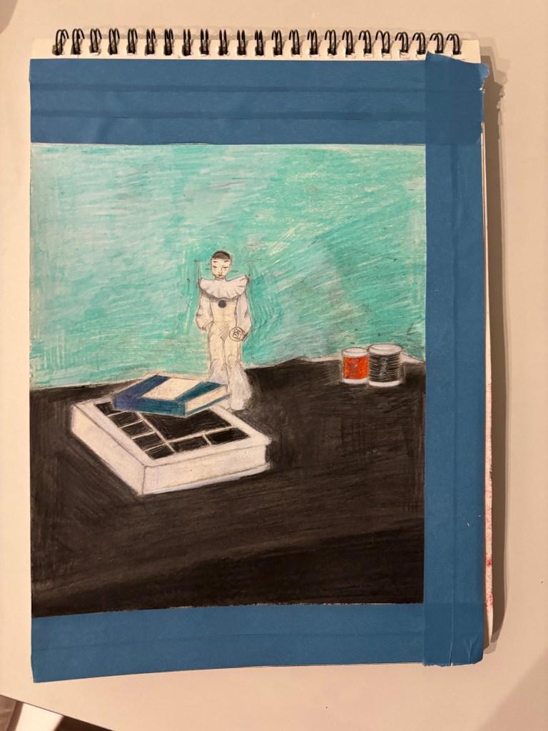
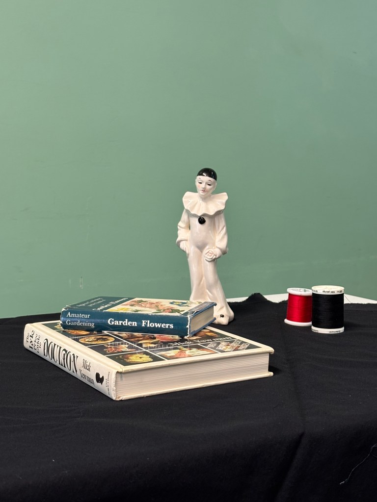
I created a colored pencil drawing based on an observational still life a small statue, a stack of two books, and two spools of thread ( black and red ), all set against a green wall and a black cloth foreground. My aim was to translate this arrangement into a colored medium while focusing on the contrast in forms and textures.
I used a pencil to sketch, frame the objects, measure distances and dimensions of objects from rectangles, circles (for the head of the statue) and cylinders. Then I colored with some colored pencils and soft pastels (used a sponge to blend the colors more smoothly).
The drawing quite captured the composition and atmosphere, translating the cool, muted color scheme of the original photograph effectively, and the color accents held their intended visual pop. However, the result showed a struggle with realistic form: while the geometric books look stable, the complex curves of the figure (actually, I use some technique of drawing anime characters, so I was really not good) and my color technique was better but it was still not perfect.
This drawing practice reminded me that shading and tone are the most important tools for making things look real and deep. Getting the darkest shadows and brightest areas right is key to creating a sense of light. For future work, I think I need to focus on using color better. When drawing the white figure, I learned I must use a wider range of light colors to show the shadows, instead of just leaving the paper white. I also need to make my darkest shadows deeper to make the light look more dramatic and help me show the different textures of things.
