Week 6 – Review
3 pieces of work that I think are my best
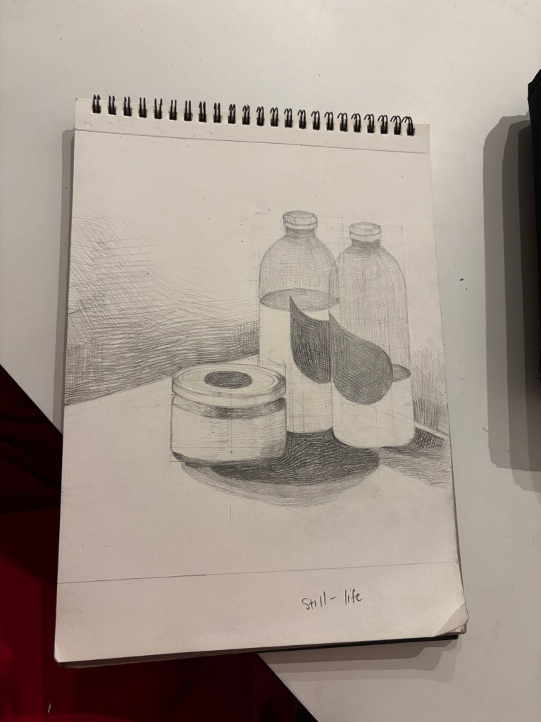
The first piece of work, I think, is my best outcome of still-life drawing, because it successfully translates from 3D to 2D. One of the keys to its success is that it has a good proportion of the original image, plus the use of simple geometric shapes to draw the whole. The cross-hatching technique depicts the material of the object is quite successful, depicting the transparency of the bottle and the water inside. The shading is also quite clear, creating where the light source starts and the shadow on the surface of table. Those keys do a good job on the still life theme.
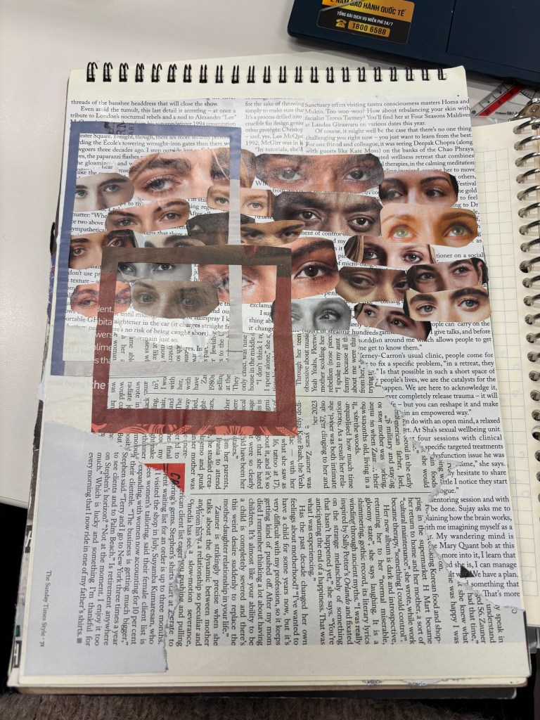
For the second piece of work, it is composed of many different images but depicts emotions and ideas without being disjointed. The immediate eye impact is the best successful key, glances of judgment and observation in the chaos and the text images behind increase the level of tense. This collage depicts social judgment of social eyes.
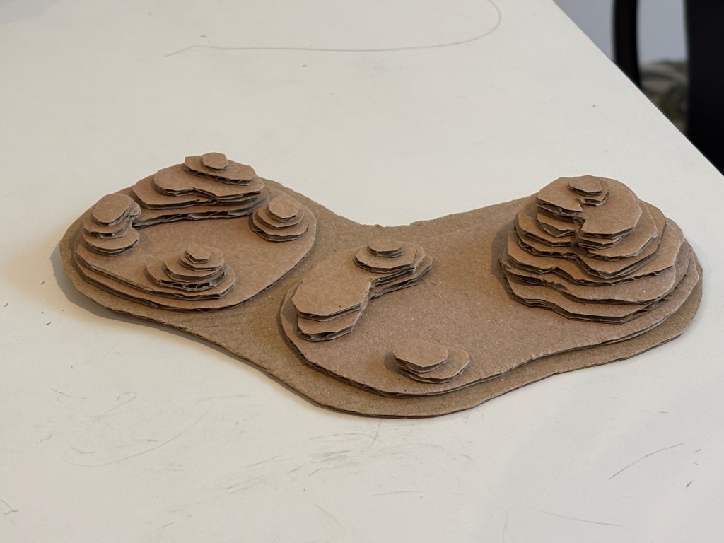
For the third work, it becomes the best outcome because of its technical execution and its clarity. It successfully captures the 3D of the mountainous terrain, which depicts the rough of the mountain and the two mountain parts are joined together to form an overall island with high mountains and low mountains.
3 pieces of work that I think can be improved
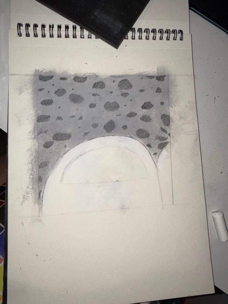
The first piece of work, I think, needs to be improved because the texture and value is not clear, everything is still flat. It successfully created the overall layout, but failed to create a separation between the road and the sandals, and the texture of the sandals and gravel parts on the surface of the road. To improve, instead of using soft pastels, I would try using the pencil to make the gravel part, then I could make the shadow for the sandal to make it less flat and create the difference from the road.
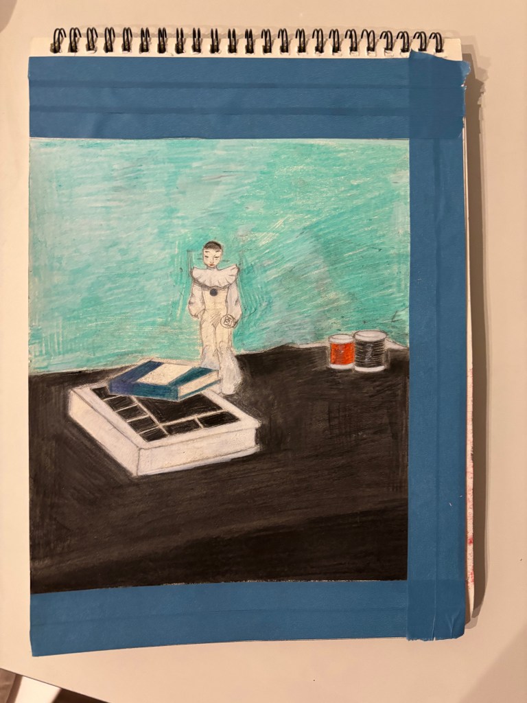
The second piece needs improvement in coloring and perspective. The color strokes are obvious, making the surfaces (especially the background) look a bit rough. The perspective of the books and other objects seems a bit off. The success of it is the arrangement of objects quite good, but the objects lack clear shadows, making them appear to float on the table and making the picture flat. To improve, I would try layering and blending techniques when using the colored pencil, and shade with colored pencil then paint the whole.
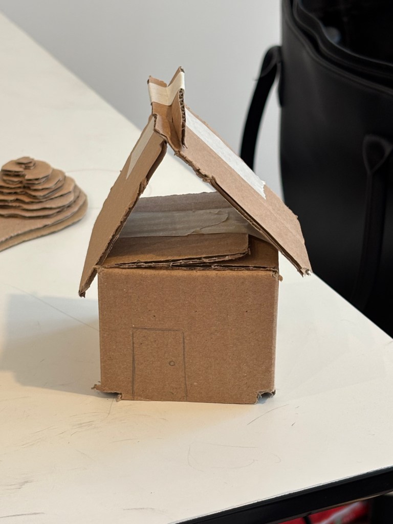
The third work, I think, it is still rough and lack meticulous, but quickly and efficiently convey the basic geometry of a house. The cutting edges are not sharp and the roof is not firmly fixed. To improve, I would use a sharp box cutter and a ruler to cut clean, straight lines and take extra care when gluing (the sides together to ensure they are tight and square).
Reflection:
I can see my weak points and strong points through those works. I work well with pencils ( still-life) and do not with colors(also still-life and texture) , I better at using layers(moutain terrain) than assembling ( cardboard house). I think I should practice more with assembling cardboard and other materials because it is neccessary for my future work. Moreover, color pratices are also needed for leveling up my using colors skill.
