
Week 1 – Introduction
Today, I learn about Research → Record → Respond cycle and what I think when I heard the word “Journey”. For me Journey is about the process of changing somethings. To illustrate, when I learnt a new language such as English, I change from only speaking Vietnamese to Speaking both Vietnamese and English, and the proccess how I do it is learning theory from school or ielts centre → pratice → mistakes → improve → repeat actions. All of that is Journey.
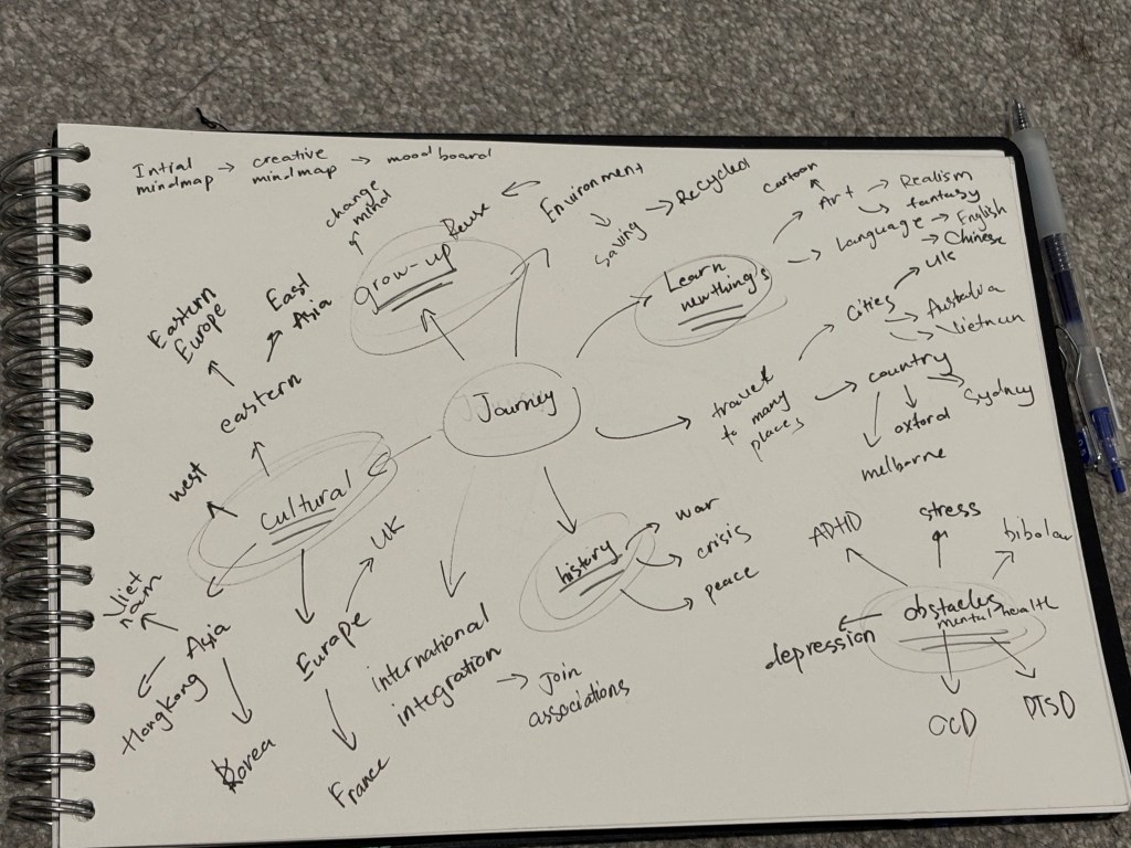
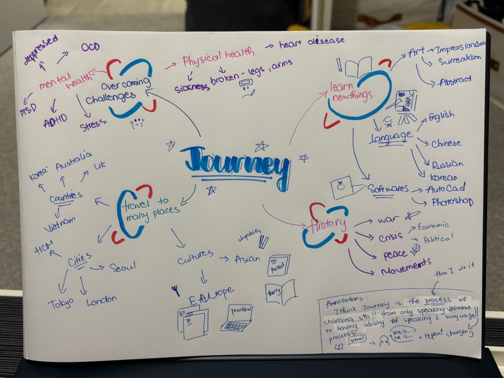
The first image is my mindmap made in class activity. The second image is another version of the first one which I draw sketches to illustrate what I mean and I use many color to make it. When I heard the word “Journey” i think it should be cold color and I choose blue, because I trust my intuition.

This is my moodboard about the word “journey”
Artist: Claude Lorrain
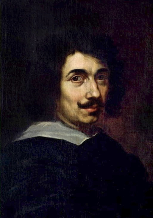
I choose Claude Lorrain for my artist research who is known as the father of European landscape painting.
- Research
The reason why I choose him is when I went to Oxford with my new flatmates in the break after semester I. I went to Ashmolean Museum (the University of Oxford’s museum of art and archeaology), I bought the book ” The Enchanted Landscape” which I saw on a sale shelf, but I really like the cover and I thought I will use it in my semester. I had an overall look before I bought it, I was impressed with the detail of each painting was drawn in meticulous way. I didn’t see Claude’s works in the library, because I just went to 2 floors of the museum, but the museum has 6 floors.
- Analysis
His artworks
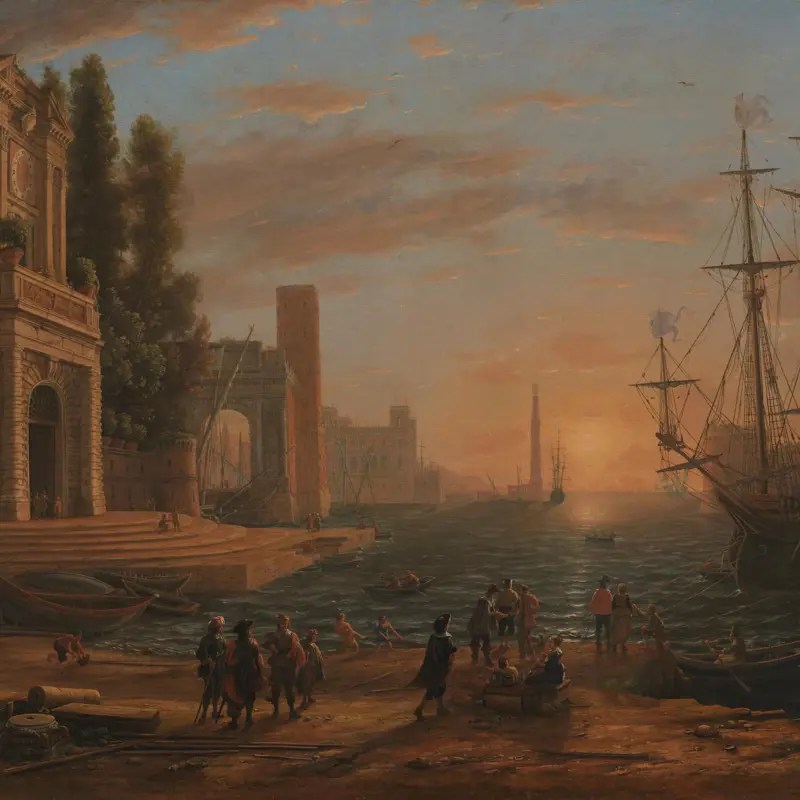
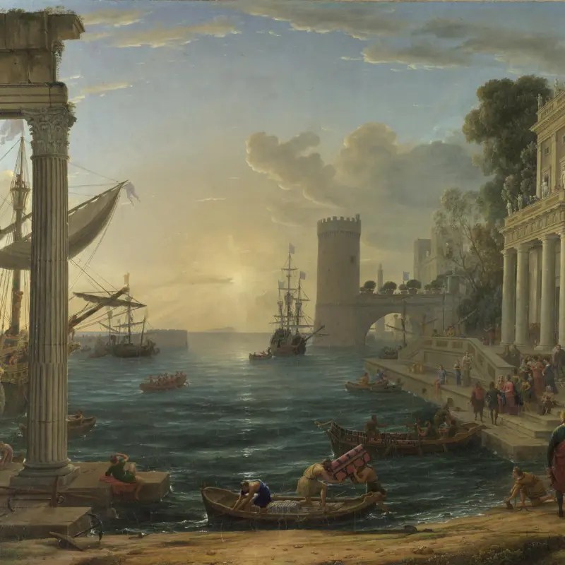
This painting is placed in room 29 of National Gallery in London.
http://www.nationalgallery.org.uk. (n.d.). Claude | A Seaport | NG5 | National Gallery, London. [online] Available at: https://www.nationalgallery.org.uk/paintings/claude-a-seaport.
-A Seaport-
Based on this book which I bought from the museum, the painting was done with oil on canvas, something I’ve never tried before.The architecture in the paintings is based on real 16th-century Roman buildings and ruins, such as the gates to the Farnese Gardens and the Arch of Titus.
I really liked how he created depth in the painting by placing the towers in the background, blurring the horizon, which gave me a feeling of freedom and boundlessness. In addition, he placed the sun directly in the center of the painting, instead of just depicting sunlight shining down like in most landscape paintings I usually see. This made me feel like it was a romantic and vibrant space. Furthermore, the use of dark colors for details like the people and the ship prevented the painting from feeling disjointed. The rather cool colors evoke the chilly feeling of early morning. Additionally, I really appreciated the landscape paintings that combined natural elements, ancient architecture, and dynamic and static imagery.
This painting is located in room 36 of the National Gallery in London.
http://www.nationalgallery.org.uk. (n.d.). Claude | Seaport with the Embarkation of the Queen of Sheba | NG14 | National Gallery, London. [online] Available at: https://www.nationalgallery.org.uk/paintings/claude-seaport-with-the-embarkation-of-the-queen-of-sheba.
-Seaport with the Embarkation of the Queen of Sheba-
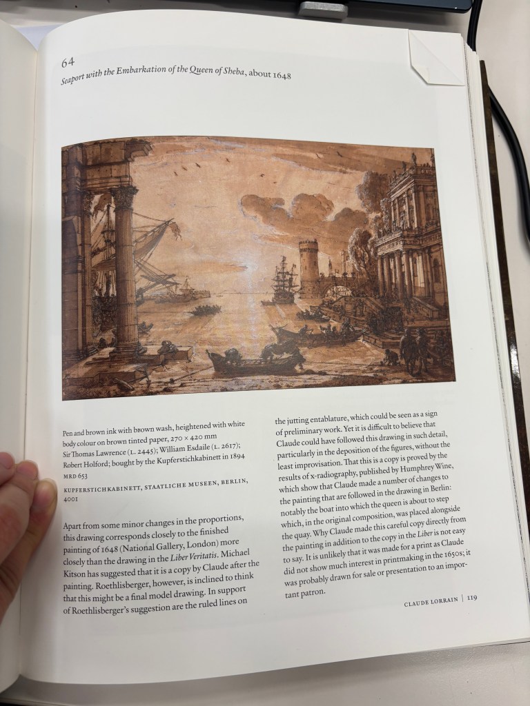
I don’t see any paintings of “Seaport with the Embarkation of the Queen of Sheba” in the book, but there is a page about this painting. This a copy of ”Seaport with the Embarkation of the Queen of Sheba” after he finished the painting
Personally, I like his sketching style of the painting, seen through freehand strokes that don not focus on perfect details but instead convey emotion and atmosphere, make me feel more relaxed and connected to the artwork.
Unlike the vibrant and warm colors of the previous painting, this one has a brighter, cooler tone. I feel this painting has a good visual balance, thanks to Claude Lorrain’s unique lighting arrangement in both paintings. Furthermore, he used many historical elements in his paintings, a harmonious blend of different historical periods.
In overall, Claude Lorrain inspires me with his use of architecture from different historical periods and his use of light to create depth in his paintings, giving them a sense of freedom and endlessness. Plus, the highly detailed architecture is incredibly captivating to look at.
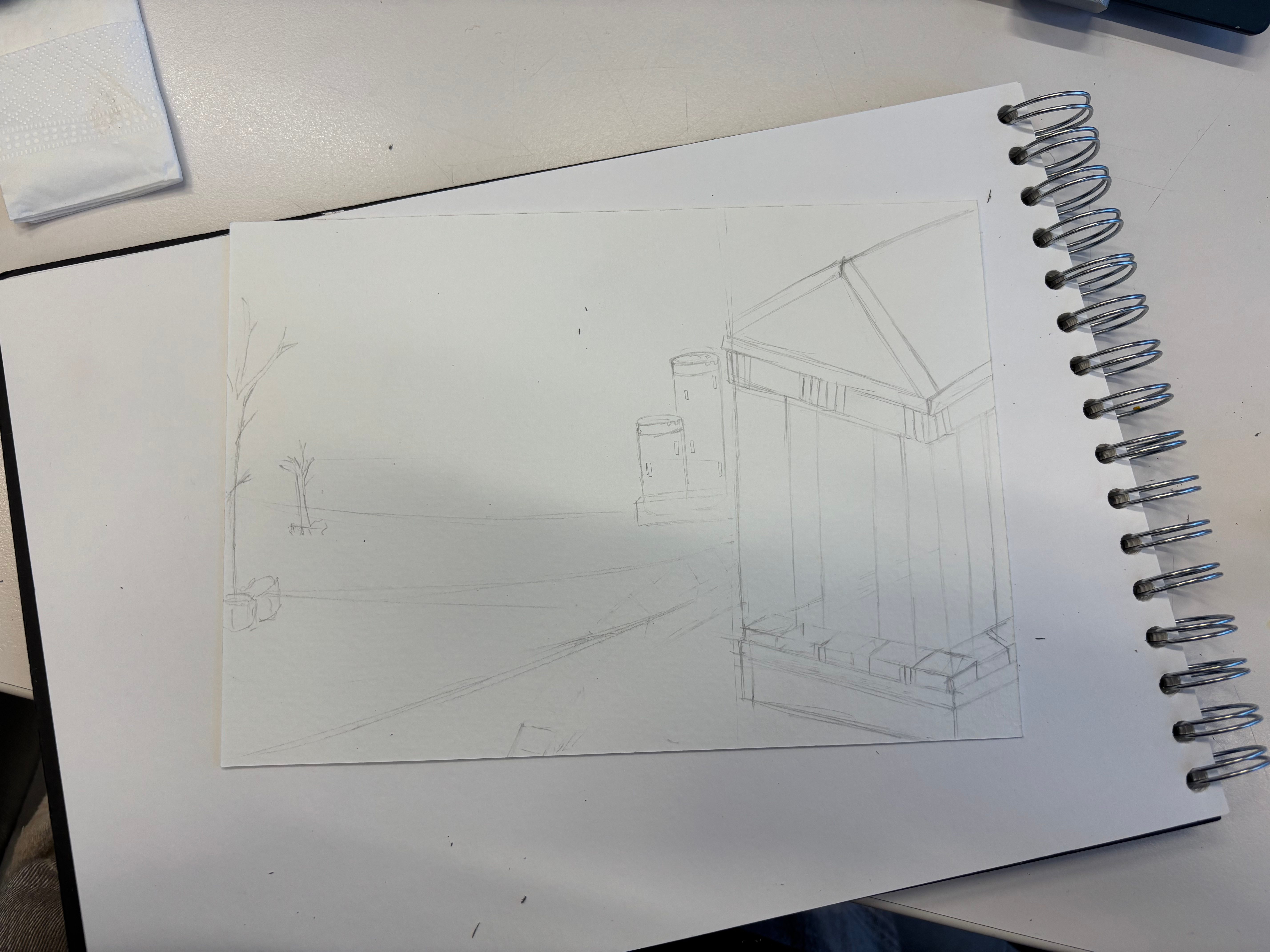
- Respond
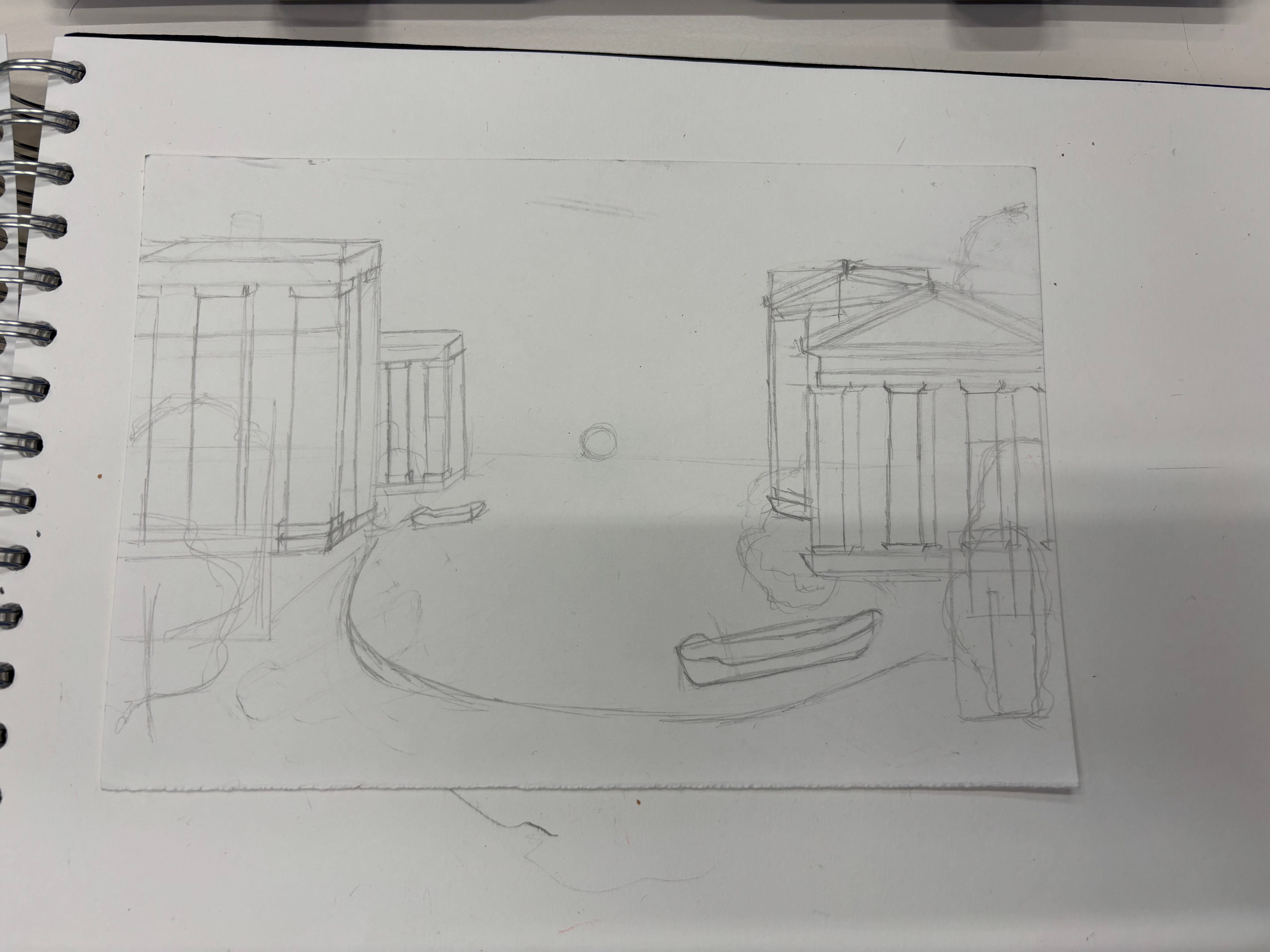
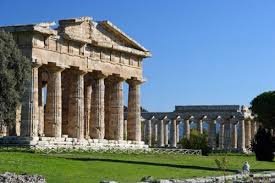
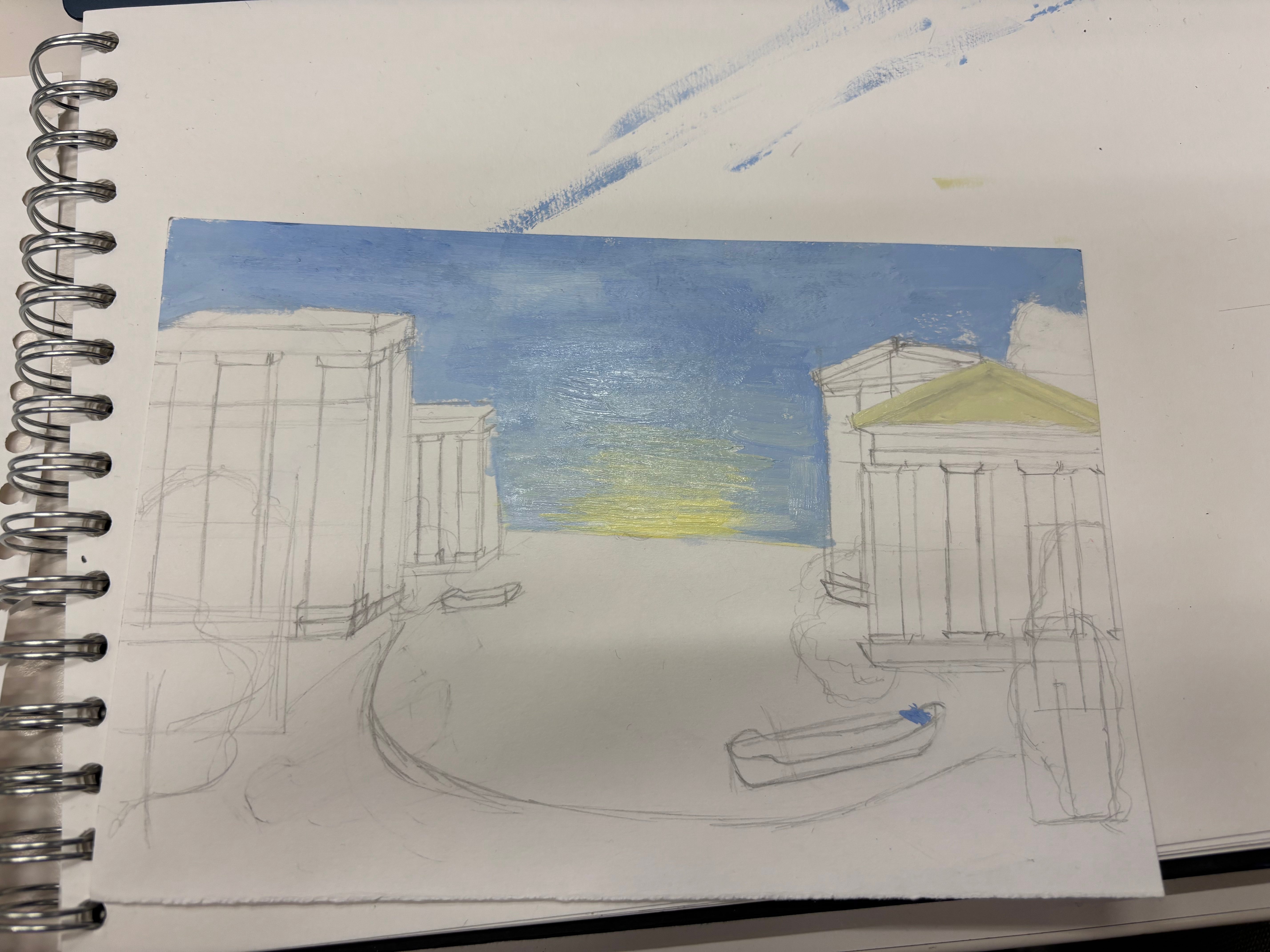
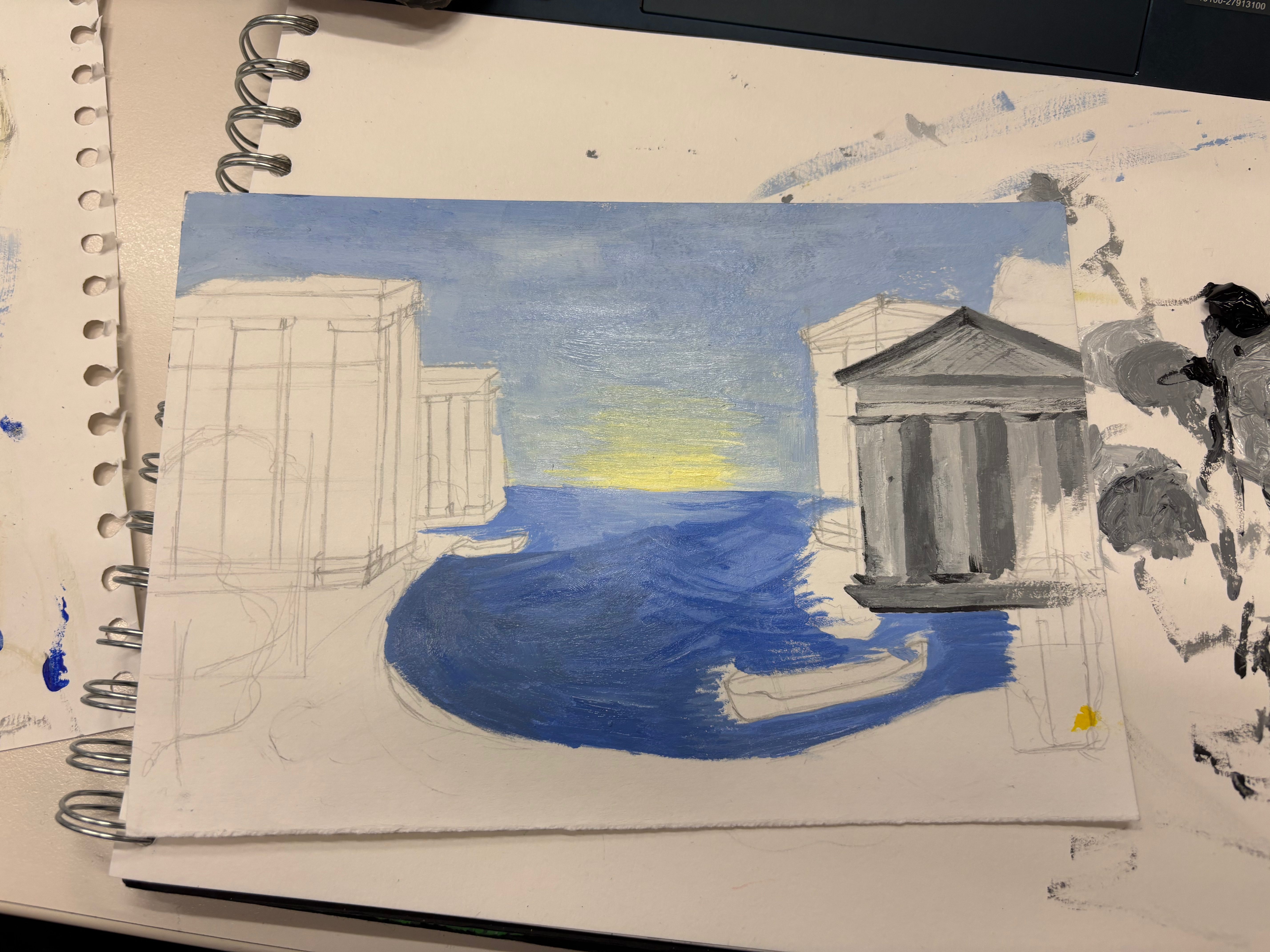
For artist respond, I use acrylic colors for this, the reason is acrylic colors and oil colors can allow layering techniques. I draw the layout first to have the overall frame for the painting. I use some Greek Architecture for buildings.
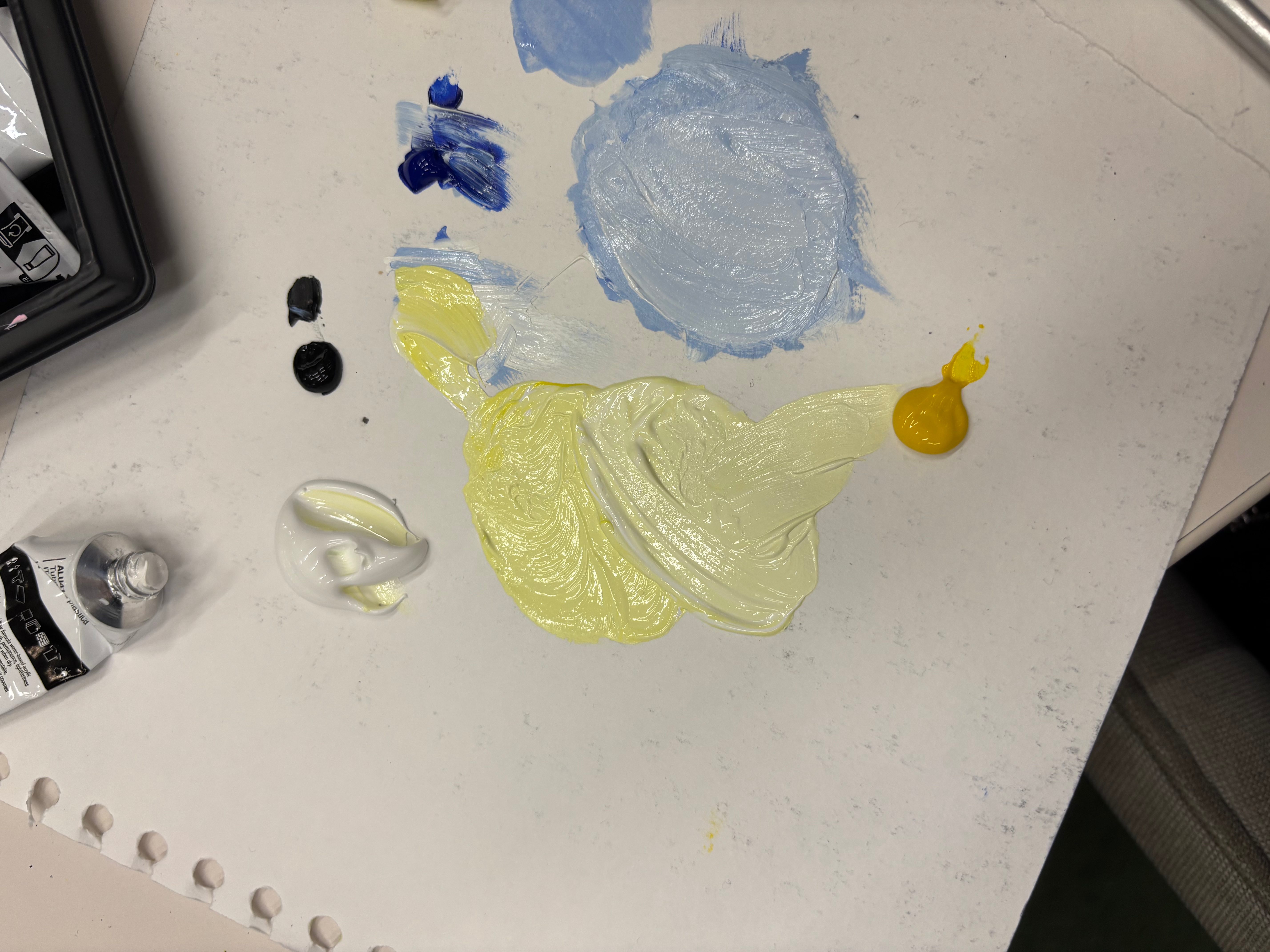
The challenge for the coloring part is I forgot my pallete at home so I mix colors on paper, it made the moisture in the paint gradually seeps into the paper, so it is hard to blend while coloring it. However, I used a wet brush to pick up the paint, which makes it easier.
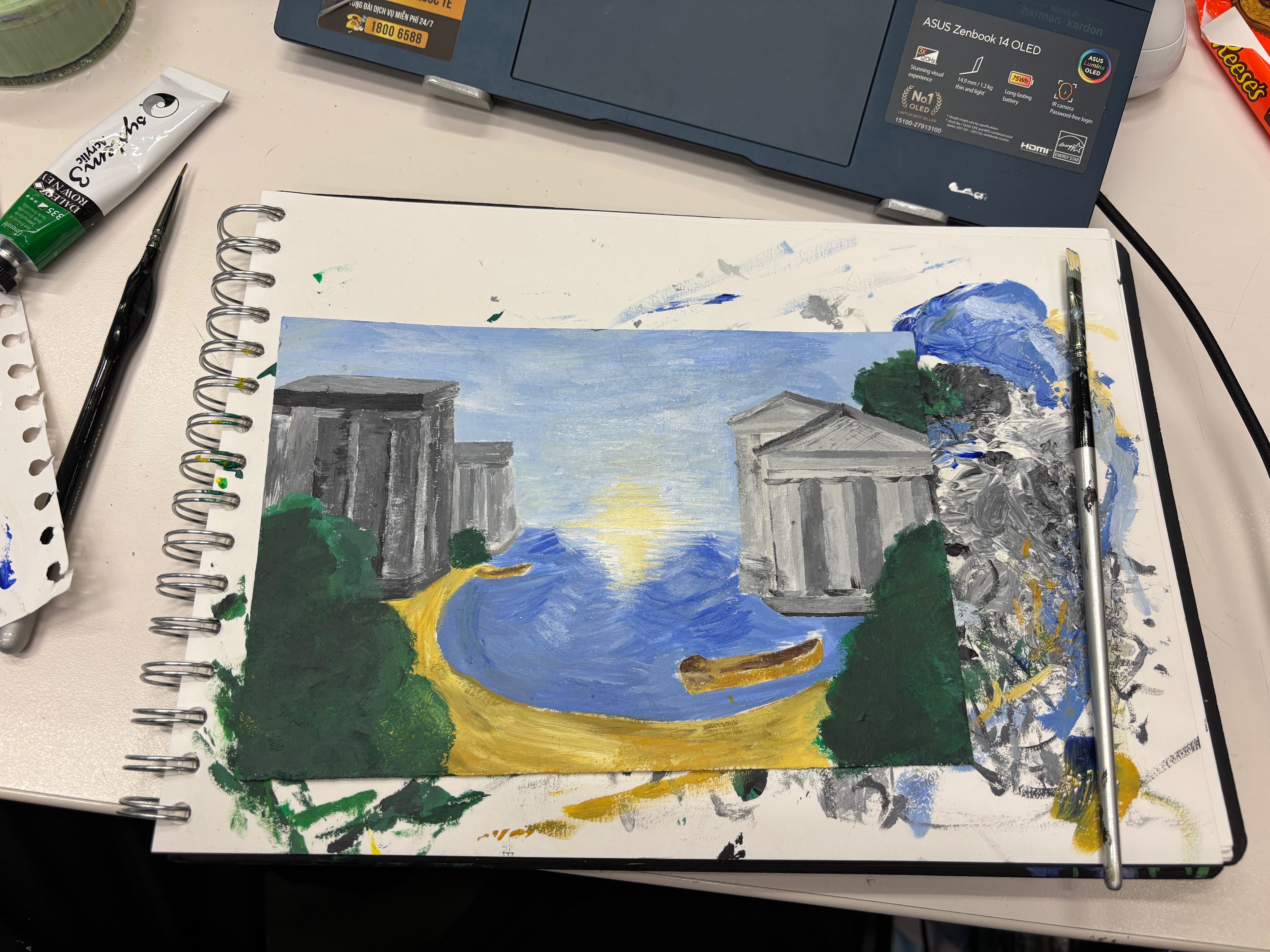
In the end, I feel I successfully broke up the horizon line like Claude did, and I like that it makes the painting smoother. Additionally, I used a composition quite similar to Claude’s, where the colors become darker and bolder towards the center and lighter towards the distance, drawing the eye to the center of the painting. The sunlight is also emphasized quite well. However, what I didn’t like was that the details of the buildings weren’t clearly depicted and were too flat, failing to create a 3D effect.
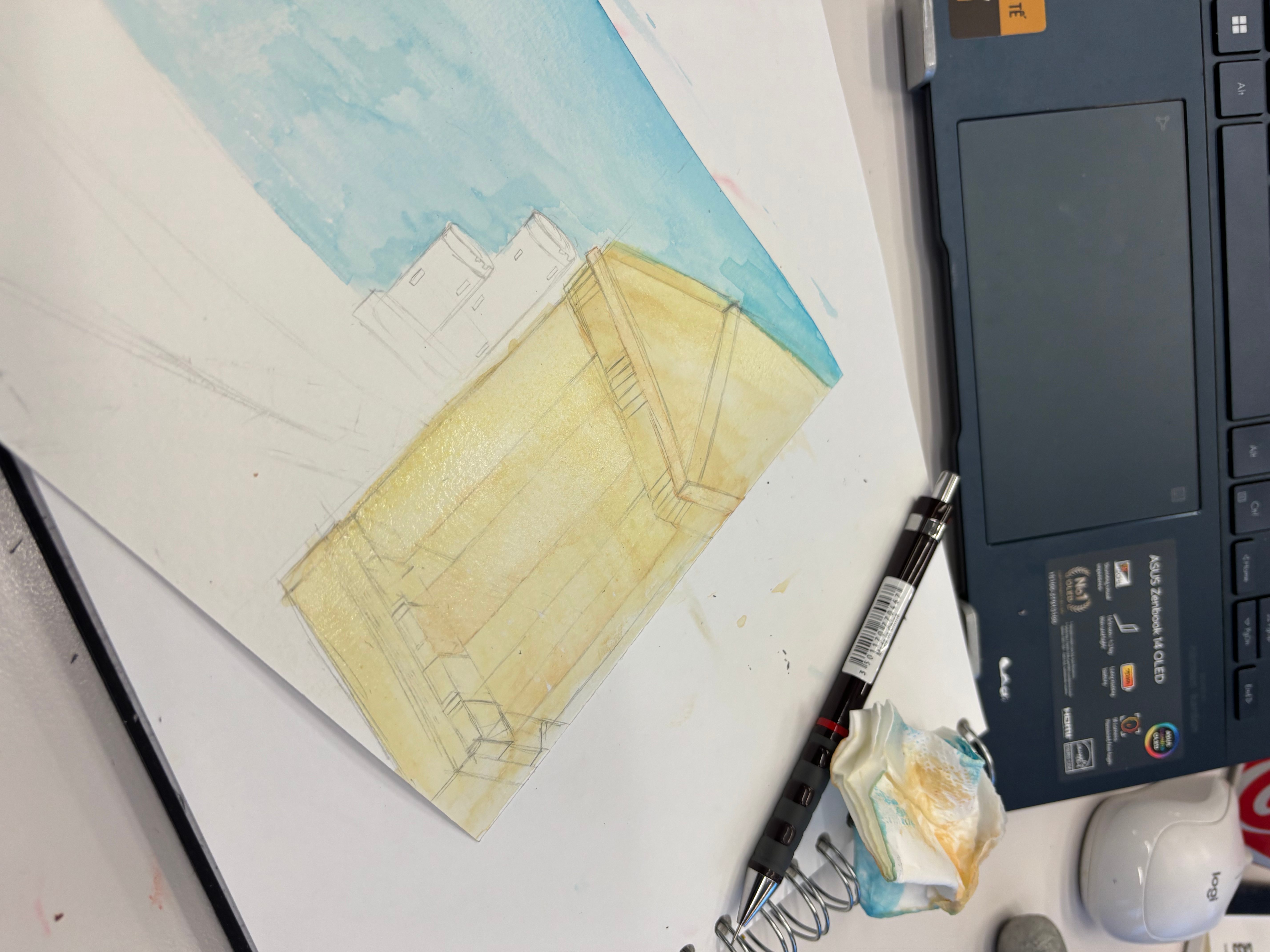
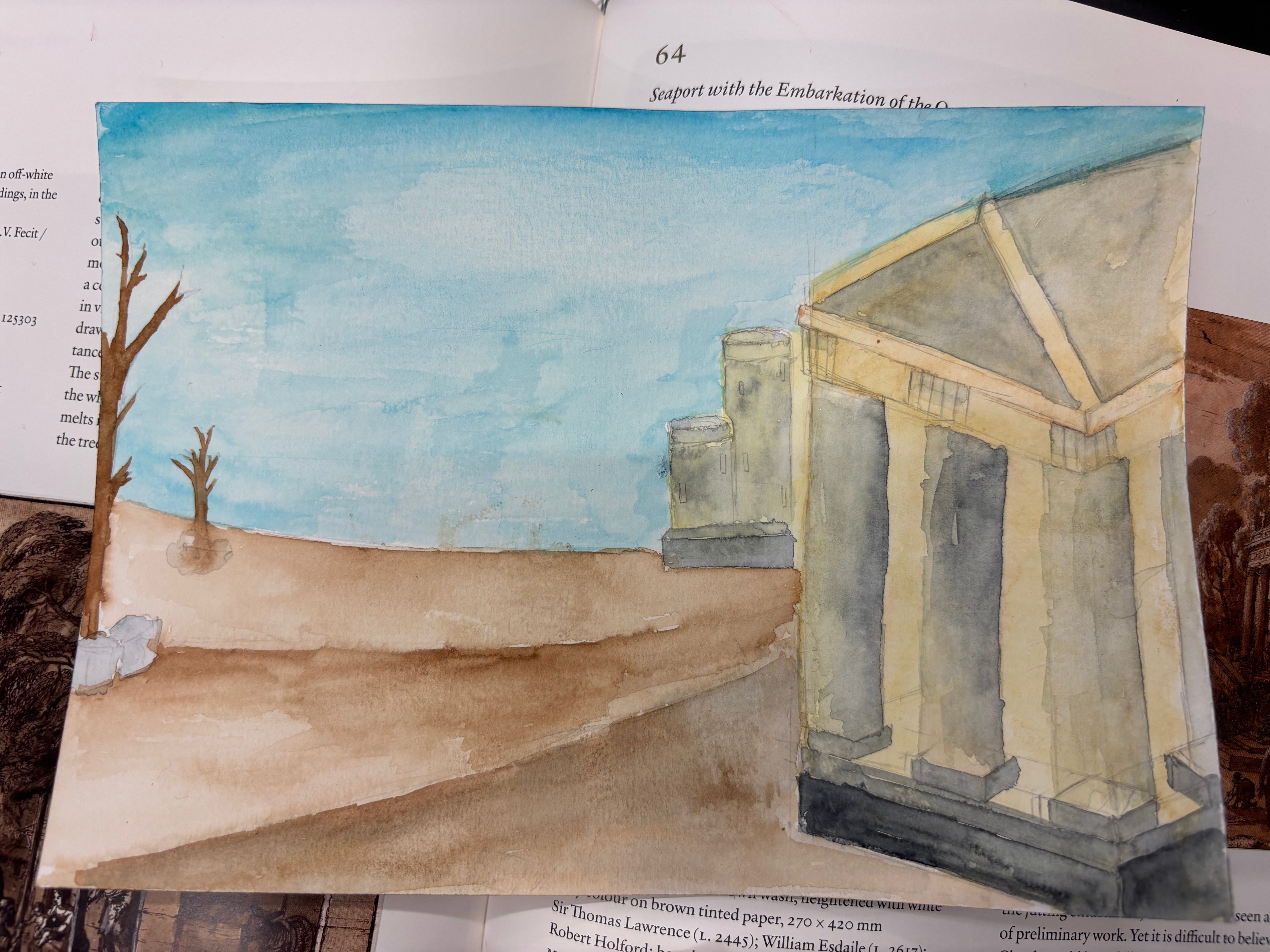
I experienced with watercolor, it does not work so well, water color is hard to control and it can not apply layering techniques as acrylic colors or oil colors. I also had to wait for it to dry If I want to apply a different color over the previously applied color.
