
Week 10&11: Poster Development and Presentation
Presentation
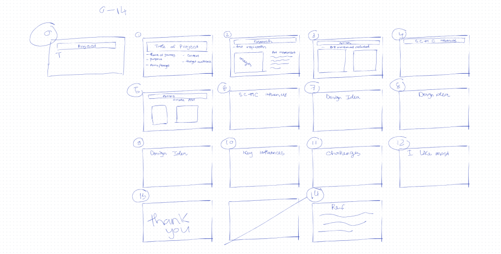
Next week (w11) is the final presentation for ILS and ART103-104 which is really important to the my grade. I am really scared of presentation so this week we were preparing for the presentation.
The presentation which included 15 slides about my final outcome this semester and the journey in BCUIC.
My tutor showed me some presentation slides as examples of poor design, contrasting them with what slides should actually be: clear in their headings and content, not overloaded with text, and featuring relevant images.We also need to cultivate the right mindset and a professional look, and deliver the presentation confidently with a clear, strong voice, something I’m quite worried about, given that I’m an introvert.
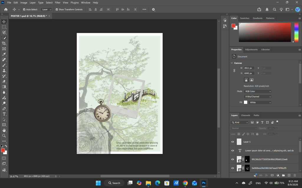
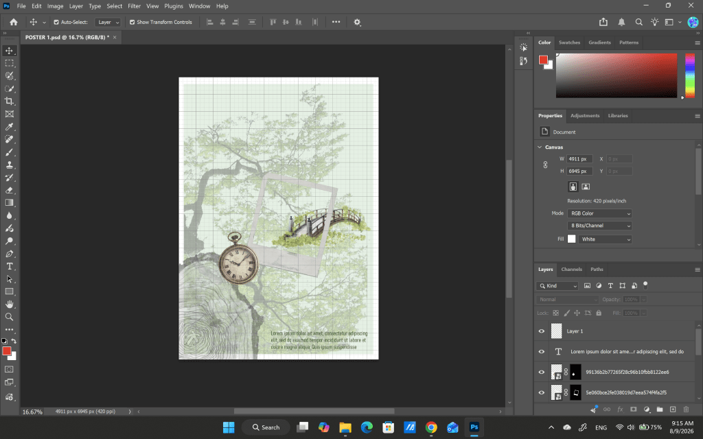
Based on key word/ influence so I choose some elements to put in poster.
Tree background and wood grain: The older the tree, the greater the number of accumulated growth rings. Each year of growth, the tree adds a new ring consisting of a layer of wood.
-> This represent for the growing up of myself.
Clock: representing the presence of time
->I believe time plays a crucial role in a person’s life. It only moves forward, never pausing or rewinding so moments that have passed become memories.
Bridge: representing the start of a new chapter or a new journey.
Polaroid frames: represent frames of memories.
But I do not really this poster because the images do not connect with each other so well.
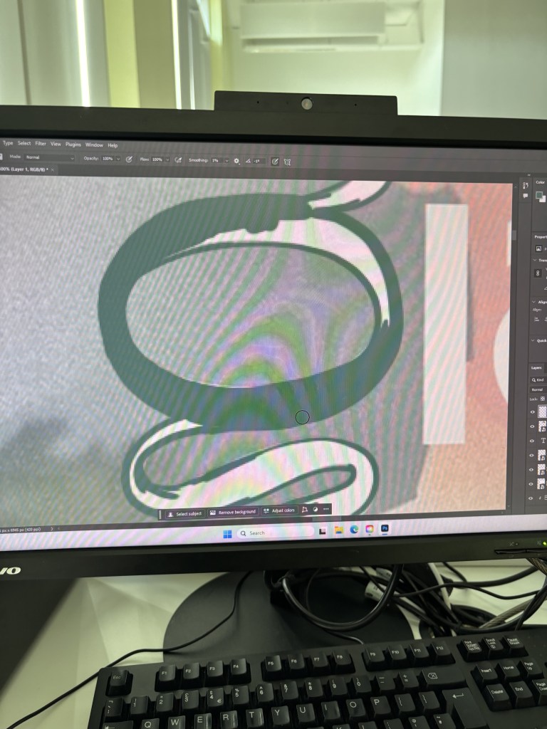
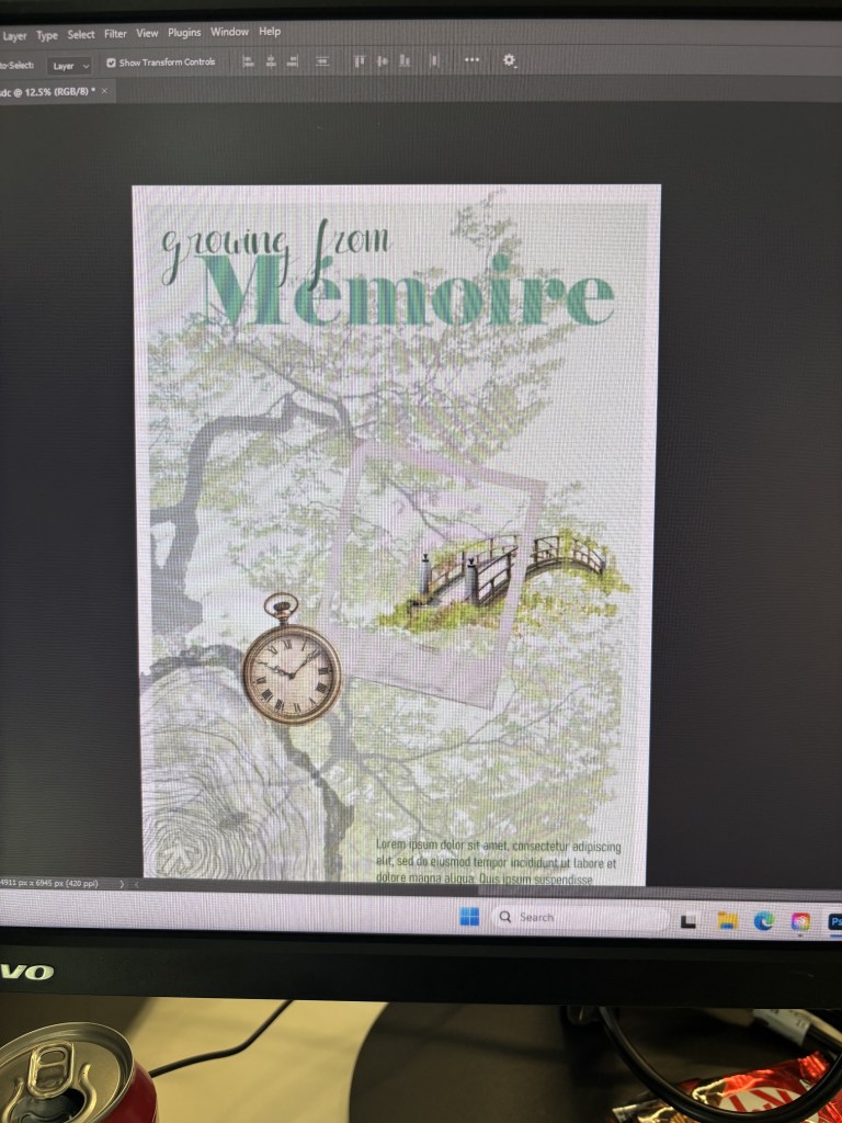
Somehow, I do not feel I like it so I think I should start another poster.
Poster Version 2
The choice of colour: Green symbolizes vitality, growth, and the abundance of nature. We often associate this color with health, youth, and a balanced energy that fosters both productivity and inner peace.
-> I want to have a health growing up so I choose green which represent for growth and health.
Reference:
Smith, K. (2021). Finally, color explained by an expert in a way that everyone can understand. [online] Sensational Color. Available at: https://sensationalcolor.com/meaning-of-green/ [Accessed 8 Aug. 2026].
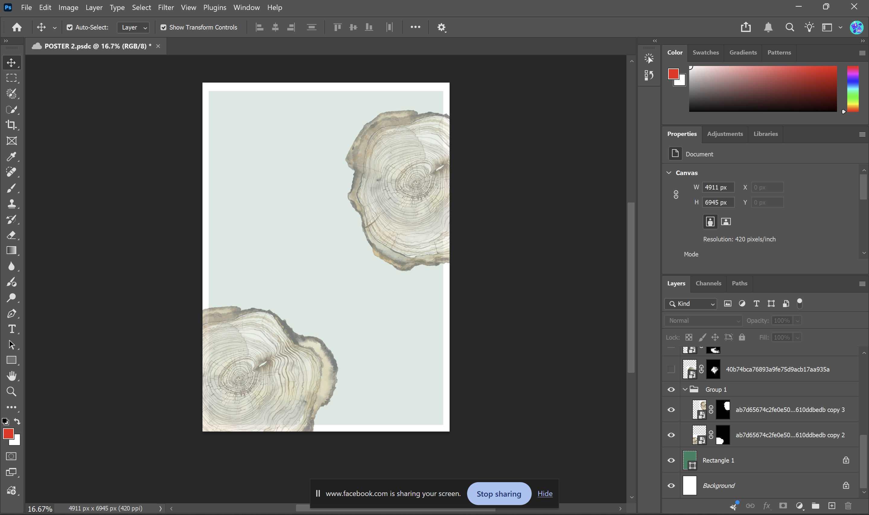
First, I want some images represent for the growth. Wood grain patterns reflect a tree’s age; the denser the grain, the older the tree (UCAR, n.d.). I think this is quite similar to people, as we become more mature and steadfast in our thinking as we grow older.
Reference:
UCAR (n.d.). Tree Rings and Climate | UCAR Center for Science Education. [online] scied.ucar.edu. Available at: https://scied.ucar.edu/learning-zone/how-climate-works/tree-rings-and-climate [Accessed 8 Aug. 2026].
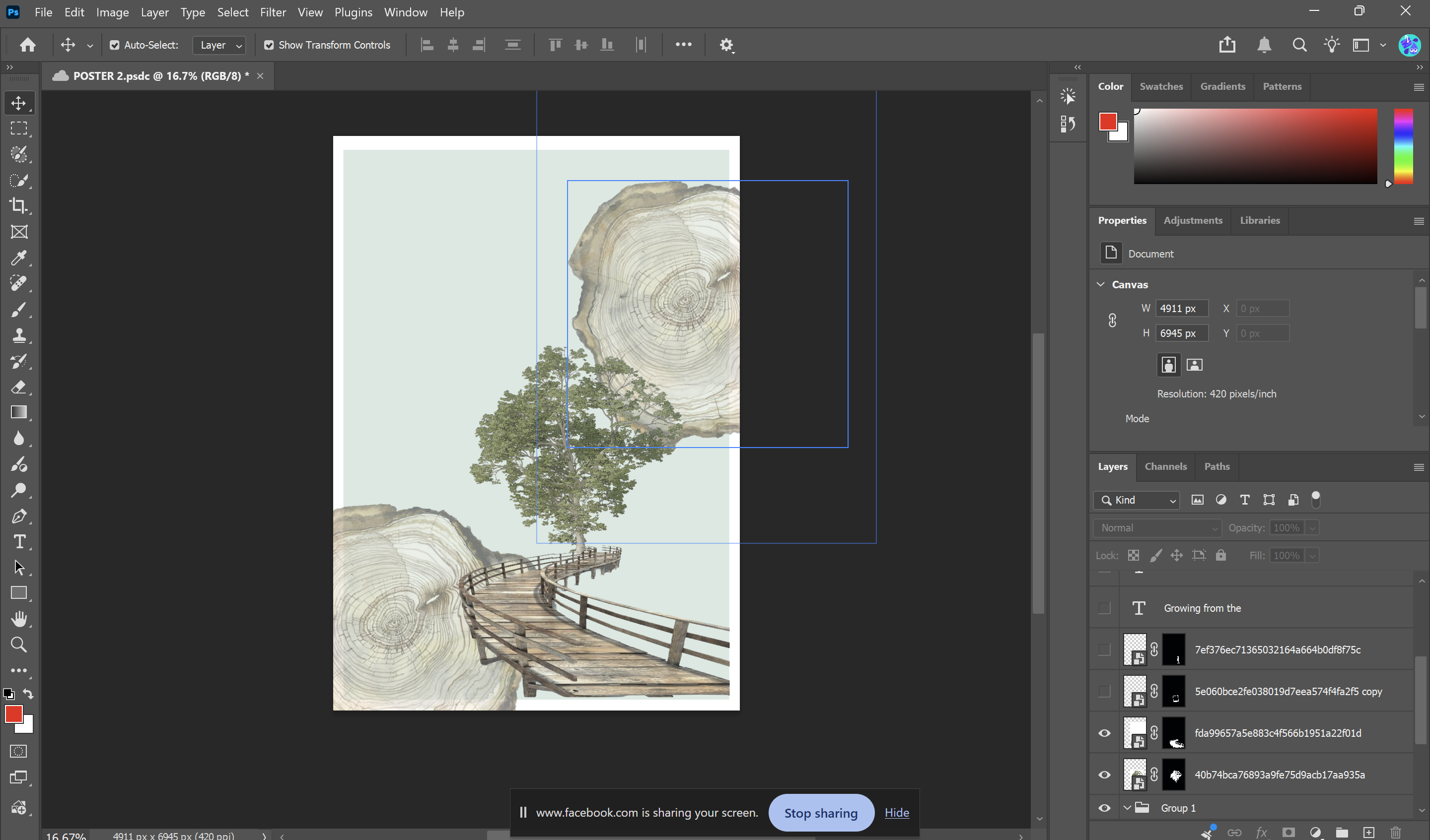
For me, I think a bridge symbolizes the journey of overcoming hardships and obstacles or transitioning into a new stage of life.
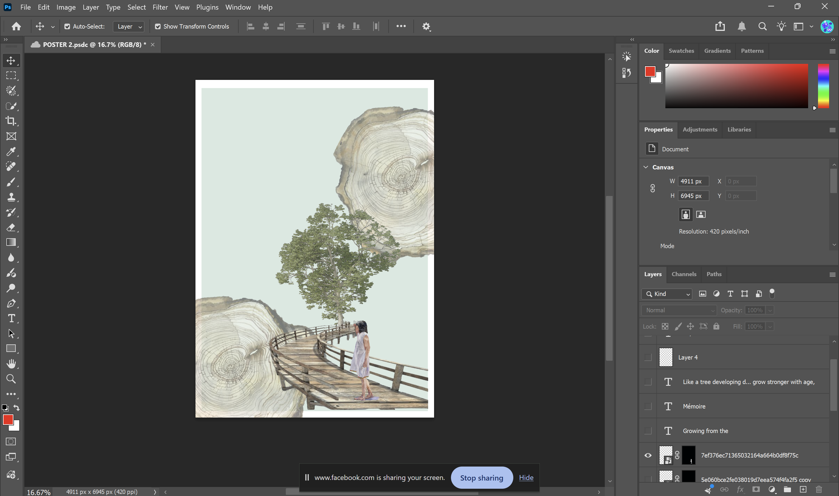
The concept of an inner child serves as a metaphor for the part of the mind that holds all the memories, emotions, and experiences from one’s childhood.
Reference:
Goldstein, E. (2023). What is an inner child and what does it know. [online] Integrative Psychotherapy & Trauma Treatment. Available at: https://integrativepsych.co/new-blog/what-is-an-inner-child [Accessed 7 Aug. 2026].
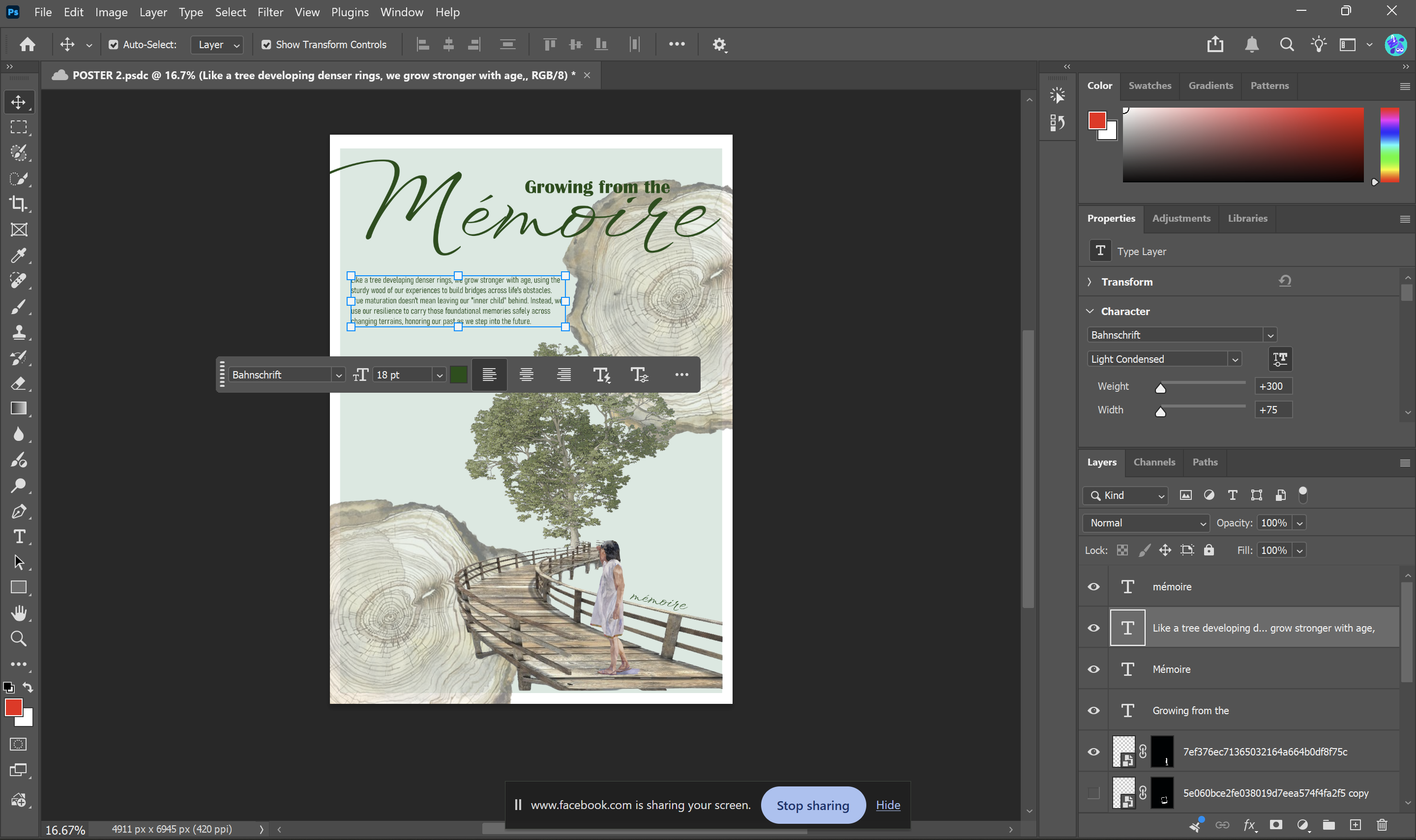
My initial idea was to use a flowing, elegant font for “memory” and a simple font for “growing from the.”.
The meaning of the poster: Memories are the foundation of our growth, serving as both an anchor and a compass. To me, human maturation is much like the growth of a tree: just as a tree develops denser, sturdier wood rings as it grows, a person becomes tougher both mentally and physically with age. A bridge symbolizes the journey of overcoming hardships and obstacles or transitioning into a new stage of life. And the concept of an inner child serves as a metaphor for the part of the mind that holds all the memories, emotions, and experiences from one’s childhood. Therefore, true maturation is not about abandoning that inner child, but rather cultivating a protective landscape around it. The sturdy wood of our experiences forged through years of weathering life’s storms becomes the very material we use to construct our bridges. We cross these bridges not to escape our past, but to carry our inner child securely across the changing terrains of life, continually honoring the profound foundational memories that formed our very first rings of growth.
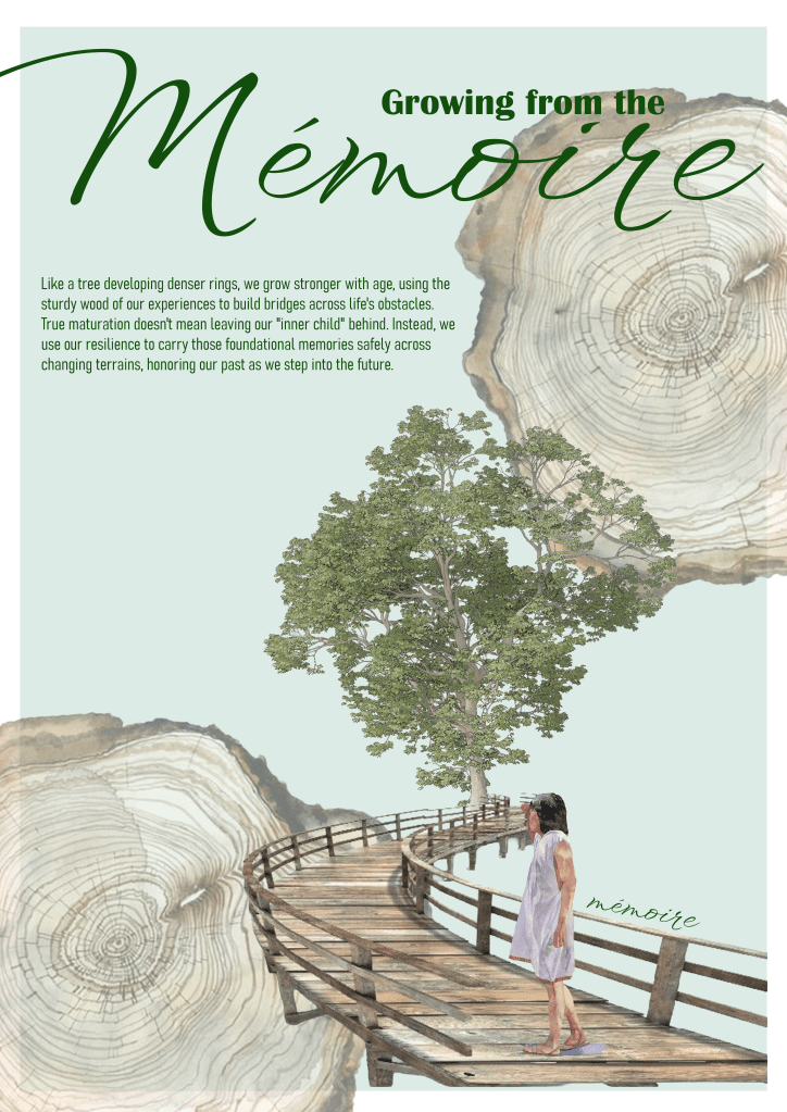
Then my tutor told me to add more text by let it avoiding the tree, so I keep the full version of the meaning of the poster.
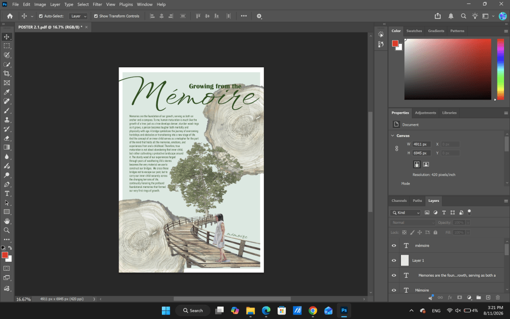
The elements in the poster:
+ The tree ring: https://www.pinterest.com/pin/170644273367615939/
+ The tree: https://www.pinterest.com/pin/793900240611165928/
+ Bridge: https://www.pinterest.com/pin/793900240611166072/
+ The child: https://www.pinterest.com/pin/793900240611165864/
The fonts:
Leuschke, R. (2026). Licorice – Google fonts. [online] Google Fonts. Available at: https://fonts.google.com/specimen/Licorice?preview.text=Mango&preview.size=66&categoryFilters=Feeling:%2FExpressive%2FAwkward [Accessed 11 Aug. 2026].
Leuschke, R. (2026). WindSong – google fonts. [online] Google Fonts. Available at: https://fonts.google.com/specimen/WindSong?preview.text=Mango&preview.size=66&categoryFilters=Feeling:%2FExpressive%2FAwkward [Accessed 11 Aug. 2026].
ILS1ARTB Evaluation
This evaluation will explain my development in the ILS1ART module in the third semester of BCUIC. This semester, I have developed my critical thinking and writing skills more academically in ILS1ART. Whilst studying this module, I realised that I can write essays that are more logical and relevant to my interests. I really enjoyed the module this semester as it allows me to research and understand new knowledge. Also, the poster provided me a chance to see the true meaning and source of inspiration within me so I can develop myself more as an art student.
For assessment A, I was required to write 4 short essays about different architects which allowed me to broaden my thoughts on architecture, which brought me more perspective of how people handle different projects. Plus, the PESTLE model helped me a lot in the process of writing 4 short essays which showed me a framework of 6 elements that influenced artists’ decisions or designs at the time they did their projects. For example, I had learnt that in the post-war period they invented the Brutalism movement in architecture when they used bare concrete to build vertical buildings to have more accommodation for people at that time because of lack of materials and financial. This showed me that artists or architects design projects because of many factors, not only because they liked or wanted to do it that way. I found that was interesting when I dug deeper into the reason behind their decisions because that can become study cases for me to do projects in the future. To illustrate, Bjarke Ingels was influenced by the environmental factors which they choose to eco-concrete to minimize the CO2 emission. The PESTLE model made me more sensitive when I analyse an artwork which I question more about the reasons or purposes behind it. Also, in the process of writing an essay, I got a lot of feedback from my tutor and my peers which was really helpful to develop my essay and writing skill. The reason for this is that I had chances to know my mistakes and what I needed to write in my essays that was relevant and coherent. The challenge in the assessment A was carelessness in the process of writing. This is because I had many small mistakes such as unclear title, tense, using American English and not referencing in the right way. Because I thought these were just small mistakes that I could fix after the content. As a result, I panicked in the last minutes of the submission to fix all of them. This became a lesson for me in the future that I need to be more careful both in the process of writing and after writing.
For assessment B, the challenge was because I am a meticulous person, it is hard to find what I liked to put in my poster which got me confused about myself. This took me many hours to identify and find what I want to show on my poster. The most time-consuming thing was deciding on the typography which I could not find the suitable fonts for my poster. To solve it, I looked back to some keywords that helped me a lot in the process of designing the poster that I had written when I thought about my journey which helped move back the meaning of the poster. Then, I combined it with my knowledge and research to find elements of my poster. Also, I thought more about the purpose of the poster which can encourage myself in my further journey in the next pages of my life. This process helped me identify the meaning of the poster and developed it into a visual message. Also, the graphic design principles were useful because I can know what is important in the layout of a poster, so I can develop my poster better. Moreover, I also improved my presentation skills so that I can explain the content more clearly and relevant even though I still get a shaken voice when I present. I think this is because I was so worried about the time and the amount of information I needed to explain to the audiences.
To conclude, I developed and improved my skills well in researching, writing and critical thinking which allowed me to evolve more in the BA course and further. Even though I had to deal with my health problems, I still enjoyed what I have done and also applied what I learned from ILSART to other modules such as presentation and writing skills.
 Phuong Vi Nguyen